Juries Comment
-
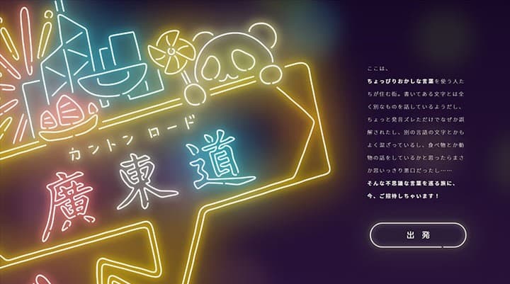
This work is not only incredibly cute in its illustrations but also impeccable in terms of quality and quantity. The sense of translating the motif into the neon sign is outstanding, and the attention to color coordination was excellent. Moreover, the playful cuteness that fills the entire work without compromise is truly wonderful.
Naoki Kitazawa(Furikake Products Co., Ltd. Character Designer / Illustrator)
-
I felt the level was high because she clearly understand the best way to showcase her own illustrations and have expressed that effectively. Moreover, using the theme of slang to capture people's attention and incorporating a large amount of content into a seamless site design so that visitors do not get bored is fantastic. Since neon is the motif, it would typically be easy on the eyes, but by narrowing the range of hues, she have designed it to be eye-friendly. It is colorful yet easy to view, making it a user-friendly content. I found it to be a very professional work.
Tanana Yagi(GREE, Inc. Designer, Development Division)